
How to Structure a Data Analysis Project from Start to Finish
A Simple Framework for Structuring Your Data Analysis Projects

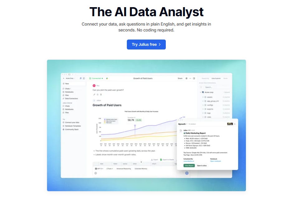
Julius Gives You Your Time Back
Most people don’t struggle with data. They struggle with time.
Time to clean the data. Time to explore it. Time to build charts. Time to redo the same analysis for the tenth week in a row.
That’s where Julius has quietly become a lifesaver for thousands of professionals — marketers, analysts, finance teams, founders, anyone who needs to make decisions without spending hours digging through spreadsheets.
Here’s why Julius matters right now:
It automates the work you repeat every week. Build a workflow once, reuse it forever. Reports that took hours now take minutes.
It speaks your language. Type in plain English — “What were our Q3 sales?” — and get clean insights, charts, and explanations instantly.
It works where you work. Even in Slack. Ask a question, get an answer, share it with your team — all inside one thread.
It gives you superpowers without code. And if you want to use SQL, Python, or R, you can go deeper with a click.
Because the biggest advantage you can give yourself is time. And Julius gives you exactly that.
👉 Try Julius for free and see how fast real insight can be: Try Julius for free here
Introduction
One of the biggest challenges people face when starting out in data analysis is figuring out how to structure a project. Data projects can feel overwhelming, especially when you’re staring at a pile of raw data and an unclear goal. A major reason for this struggle is the lack of a clear structure or plan. Many beginners simply don’t know what to include in a project or what to leave out.
A well-defined structure turns confusion into clarity. It guides you from formulating a question to uncovering actionable insights. In this article, I’ll walk you through five key stages of a data analysis project that you can use to bring structure to your work. I’ll demonstrate each step using a small coffee sales dataset. The five stages we’ll explore are:
What question(s) are you trying to answer?
What does the data look like?
Extracting insights from data
Visualizing the insights
Insights uncovered and recommendations
Whether you’re a beginner or just looking to refine your process, this framework will help you stay organized and deliver results that make an impact.
Keep in mind: this is just a guide. Every project is different, and you may need to adapt the steps to fit your specific context. different, and you may need to adapt the steps to fit your specific context.
Stage 1: What Question Are You Trying to Answer?
Every data analysis project must begin with a clear question or goal. This helps define your focus, prevents scope creep, and ensures your analysis is purposeful. The question should be specific, measurable, and connected to a business or research objective. Without a clear question, you risk analyzing irrelevant data or producing vague results.
For our coffee shop dataset, let’s ask, “Which product drives the most revenue, and how do sales trends vary by day of the week?” This question helps the shop owner decide which drinks to promote and when to adjust staffing or inventory. It’s important to write the question prominently in your notebook or project to stay focused. See below:

Stage 2: What Does the Data Look Like?
It is important to talk about the libraries that you are going to use in your project. Here is how it is documented in the project.

Before diving into analysis, it’s essential to explore the data to understand its structure, quality, and limitations. This step helps identify issues such as missing values, incorrect formats, or outliers that could skew your results. Since a data project is often created for others to review or build upon, it’s important to clearly explain the reasoning behind each step you take during the data exploration process. Here is an example:

At this stage, you are not just demonstrating your knowledge of Pandas and SQL functions. You are also explaining the rationale behind your decisions. This shows that you understand the tools and, more importantly, that you can think critically about how and why to use them.
Next, you will want to explore your data further.

This is also a crucial step in your project. You are going beyond simply viewing the first five rows of data. By checking the structure of the DataFrame, you are demonstrating that you understand the importance of assessing the state of the data before performing any analysis. Knowing the data types and spotting issues early helps you avoid errors and ensures that your analysis is based on reliable information.
Step 3: Convert ‘date’ to Datetime Format
The next step is to convert the ‘date’ column to datetime format using Pandas. This is important because the column is currently stored as an object data type, which means the values are being treated as plain text rather than actual dates.
As a general rule, always assume your report will be read by someone unfamiliar with the tools or dataset. Every step should be explained clearly to make the project easy to follow. Here is how it is documented in the notebook:

Step 3: Verify Revenue Calculations
In the dataset, there is a total_revenue column whose values are derived from multiplying the units_sold column by the price column. It is important to verify that these revenue calculations are correct, as inaccurate values could lead to faulty insights or decisions.
To verify the calculation, we will create a new column called calculated_revenue by multiplying the units_sold column by the price column. Then, we will compare the values in the calculated_revenue column with the values in the total_revenue column to ensure they match. Here is how this step can be described in the report:

In step number 5 above, once we have verified the values in the total_revenue column, we drop the calculated_revenue column.
Stage 3: Analyzing Revenue Patterns
Once we have preprocessed the data, we can begin analyzing the revenue patterns. The primary goal of this project is to understand total revenue by product and examine sales trends by day of the week. As with previous steps, it is crucial to explain the rationale behind each calculation and analysis to ensure transparency and clarity for anyone reviewing the report.
Here’s how we can proceed with this step:
Total Revenue by Product:
To understand how much revenue each product generates, we can group the data by product and sum the revenue for each group.
Sales Trends by Day of the Week:
We can analyze how sales vary depending on the day of the week. This will help the coffee shop owner identify high-traffic days and adjust staffing or promotions accordingly.
By clearly explaining the reasons behind these calculations, we not only ensure the accuracy of the analysis but also make the process understandable for anyone who may be less familiar with the data or tools used. See below:

Now that we have a good understanding of revenue per product, we can take our analysis further by examining how revenue varies by the day of the week. This step will help us identify any patterns in sales trends, such as whether the shop performs better on weekends or if there are particular days when sales are lower. See below:

Stage 4: Visualizing the Results
Visualizations can be used at any stage of a data analysis project to enhance understanding and communicate findings more effectively. However, it is important to remember that visualizations are not just for decoration; they must serve a clear purpose. Always explain why you are choosing a particular visualization and what insight it helps reveal.
In this stage, we will visualize the trends we uncovered in Stage 3:
Total revenue by product
Average revenue by day of the week
These visualizations will help us spot patterns more easily and present our results in a more compelling way, especially for audiences who may prefer visual summaries over raw tables.
Let’s start with the visual for total revenue by product:

Next, let’s visualize average revenue by day of the week

Stage 5: Insights Uncovered
Once you have done the analysis, it is important to share the insights that you have uncovered. Sharing your insights is not enough. It is also important that you share recommendations that the business can act on. In the analysis, here are the insights we have uncovered and our recommendations:
Revenue by Product: Finding: Espresso generates the highest revenue ($940), followed by latte ($792) and cappuccino ($608). Implication: The shop should prioritize espresso inventory and consider promotions to boost espresso and cappuccino sales.
Day-of-Week Trends: Finding: Saturdays (avg. $220 daily revenue) and Tuesdays ($179) are the strongest days, while Fridays ($85) are the weakest. Implication: Increase staffing on weekends and explore discounts or events on Mondays to lift sales.
Here is how this information is added to the report:

Wrap-up: Why This Structure Works
As you’ve seen, following a structured approach makes it much easier to organize your data analysis project. It ensures that you begin with a clear goal and stay focused throughout the process. Each stage builds logically on the previous one, helping you maintain direction and avoid unnecessary detours.
By documenting the reasoning behind each step, you’re not just showing that you know how to use the tools; you’re also demonstrating critical thinking in deciding when and why to use them. Clear explanations and simple visualizations make your analysis easy to follow, even for non-technical stakeholders. And by ending your project with actionable recommendations, you ensure your work can drive real business value. You can download the files used in this demonstration here.
While this was a simple demonstration, I hope it helps you structure your next project more effectively. Thanks for reading!
SQL Essentials for Data Analysis is Now Available
Learn the #1 skill in data. If you’re tired of hopping between tutorials and want a clear, guided roadmap, this is the step that finally gets you unstuck. You can grab your copy today and start the 50-day journey.
SQL Essentials for Data Analysis: A 50-Day Hands-on Challenge Book (Go From Beginner to Pro). Gumroad 35% OFF.
Master Data Analysis with Python: 50 Days of Data Analysis with Python: The Ultimate Challenge Book for Beginners
Really appreciate how you emphasize documenting the rationale beihnd each decision, not just the code itself. I've seen too many notebooks where someone runs pd.to_datetime() without explaining why, and six months later nobody remembers if it was necessary or just habbit. The calculated_revenue verification step is clutch because revenue discrepancies are usually caught way too late in real projects. One thing I'd add is that freezing your question in stage 1 helps prevent scope creep when stakeholders inevitably ask for three more breakdowns midproject.